Going to a website on one’s phone or tablet these days has become something like Forrest Gump’s box of chocolates: You never know what you’re gonna get. Sometimes you get tiny text on your phone for a site designed for viewing on larger screens. Sometimes you use your tablet and get a stretched out version of a site designed for a phone. A bunch of time you are given a dumbed-down version of a site on your phone that is missing key functionality of the main site, even if your phone is completely capable of rendering the real version of the site. And on the worst sites, there is not even a link to request the real version of the site, so you have to wait until you are in front of a desktop browser. If you still remember what it was that you wanted.
All of this is a perfect, although frustrating, example of web designers ignoring the founding vision for the World Wide Web. Simply stated, that vision is that the web be a platform upon which content can be viewed anywhere, and that it look the same everywhere.
Creating a separate mobile version of a website does not deliver the same content everywhere, or at the very least requires a doubling of the work to do so since it involves building and maintaining two websites for the same content. Using an existing website that was designed only for the desktop experience, though, really does not meet the vision for the web either. If content is displayed too small to be usable, in effect, it does not look the same. Or more concretely, the experience is not the same. So perhaps it could be said more accurately that the intention of the web’s founding vision is that the experience be the same no matter where the content is displayed.
Making the experience the same across all platforms would seem quite a daunting task at first. Screens can range from the size of a postage stamp to the size of a house. They can be very wide or very tall, or anywhere in between. And they can have other differing properties as well. In order to deliver the same experience across all such displays, there is a surprisingly simple method to use: Let the design respond to the display environment when the content is requested. This is the essence of what has come to be called Responsive Web Design.
A Better Way
Responsive Web Design is a term coined by Ethan Marcotte in his May 25, 2010 article on the website, A List Apart. In the article, though, Marcotte points out that this was really just an approach to using capabilities that had been made possible before this by “media types” in css 2.1 and by “media queries” in css 3.
Media type specifications mean that a group of style rules can be targeted at specific media (screen, print, projection). Media query specifications mean that a group of style rules can be targeted at specific properties of the display (device width, device orientation, window width, pixel density, etc.). In this way, media queries can be used to dynamically change the size or positioning of elements that would not work for a certain type of viewing experience.
Sometimes, though, this is not needed. Often by simply allowing content to use normal flow-layout and specifying all sizes in relative units, such as em or percentage, content will be displayed appropriately across a wide range of view types. But past a certain thresholds, this breaks down.
Web content is currently often laid out with the unconscious assumption that it will be displayed on a wide-screen monitor sitting a foot or two in front of the user. This type of viewing experience lends itself to a detail-rich layout with two or more columns. If the content were displayed somewhat smaller, and particularly if the display is turned to be tall instead of wide, multiple columns begin to be a problem. When the display becomes significantly smaller, font-size becomes too small even when specified in ems. And when the display becomes much smaller, multiple columns almost always force content to be way too small, and font-size also becomes much too small. Users may be able to double tap to zoom, but this inherently means that the layout is not appropriate for the display.
To correct for this, we can use media queries to write a few additional css rules that are only invoked when certain thresholds of display experience are met. With a few targeted presentation rules, we can make the display experience differences disappear. And with any luck, the user may not even notice that anything was changed. The goal is only to have the user not be frustrated by content that is tiny and hard to use, or by content that is stretched-out or dumbed-down.
The Project
This was my intention when asked to make the twocanoes.com website more mobile friendly. Responsive Web Design is not widely known yet, so it was not intended when the project was assigned to me. After I mentioned it in preliminary conversations about the project, interest was expressed to see what it could do for the site. After seeing just a little of what it could do, and how quickly it could change things, it was clear to all that this was the only way to proceed.
After researching examples of Responsive Web Design, I chose three display experience thresholds to target:
- Something in the palm of one’s hand like a small notepad
- Something tall that sets in one’s lap like a book or magazine
- Something that could be viewed across the room or that is wide enough to display a great deal of detail
Target 1 can only have content in one column and should have a relatively simple layout. Almost anything with more than one column will be too small.
Target 2 can have a limited amount of content in more than one column, but often benefits from single-column layout. A balance should be found between adding more detail but remaining relatively simple.
Target 3 can allow two or more columns and a detail-rich layout, but the “max-width” property should be used to not allow single elements to flow too widely. As an example, paragraphs should ideally be kept to 12 words per line or less.
Where to Start
I began this project by looking at the general design of twocanoes.com, both visually and in markup. I concluded that to deliver the same experience across all display types, two general responses were needed:
- Adjust font-size where needed to be appropriate for the display size.
- Handle columns appropriately for the three target display experiences.
With these two general responses, the content should be able to display well by simply using normal flow-layout and existing margin, padding, and alignment rules previously assigned for individual elements.
So the display properties to detect were width and orientation. I was told that twocanoes.com was going to be completely redesigned within a few months, so I chose to limit the scope of what I would develop to the minimum necessary to display the existing site material appropriately under all likely viewing parameters. To do this, I chose to avoid changing anything for presentation on a desktop browser or a tablet in landscape view, as the existing presentation rules handled these situations fine. Therefore I would want media queries to detect portrait vs. landscape orientation, and I would want to detect max-device-width in order to reasonably leave the desktop experience alone (not change when a desktop browser window was made narrow on an otherwise wider screen).
To write good rules for these detected properties, I looked into what ranges would describe the target experiences. I chose the following five situations that would require a specific response:
1.
/*Portrait Target 1 or 2, or landscape Target 1*/
@media screen
and (orientation:portrait)
and (max-device-width:768px),
screen
and (max-device-width:640px)
and (orientation:landscape)
2.
/*Portrait Target 2*/
@media screen
and (orientation:portrait)
and (max-device-width:768px)
and (min-device-width: 361px)
3.
/*Landscape Target 1*/
@media screen
and (orientation:landscape)
and (max-device-width:640px)
4.
/*Portrait Target 1*/
@media screen
and (orientation:portrait)
and (max-device-width:360px)
5.
/*Portrait or Landscape Target 1*/
@media screen
and (orientation:portrait)
and (max-device-width:360px),
screen
and (orientation:landscape)
and (max-device-width:640px)
These five situations would each benefit from a specific combination of font-size adjustment and column handling, as well as a couple specific rules to handle elements for which the existing html was not sufficiently clear to structure the content for dynamic presentation. If the site were not going to be completely redesigned soon, it would make sense to correct the html to be more purely structural, but this was ignored for now in the interest of limiting development time where significant html rewrites would be needed to maintain the existing desktop experience.
The goal of these rules was to first increase the font-size appropriately for the environment. This was done by setting a font-size in ems for the body element. For Target 2 (held in the lap) in landscape orientation, nothing was needed. When switching to portrait, though, a slight bump up in font-size avoids changing the experience expected. When dropping to Target 1 (held in the palm), landscape orientation needed a more significant bump up in font-size to meet the experience expectation, and in portrait orientation font-size needed just a bit more. I used 1.5em for Target 2 portrait, 2.5em for Target 1 landscape, and 3.5em for Target 1 portrait.
Universal Display Design
It is important to note that the goal of these targets was not to aim for specific devices, because devices will always change. Instead the goal was to find where a threshold was that would not allow normal styling to deliver the same experience intended. Ideally, these thresholds would include pixel density as well as width, as doing so would truly respond with the same experience no matter what display is used. In the interest of managing development time on the first pass with this project, though, width-only thresholds were chosen for now since these thresholds should be able to respond to the large majority of devices that currently exist. To complete the intention of universal display design, it would be appropriate to add pixel density thresholds at a later time.
Quick Results
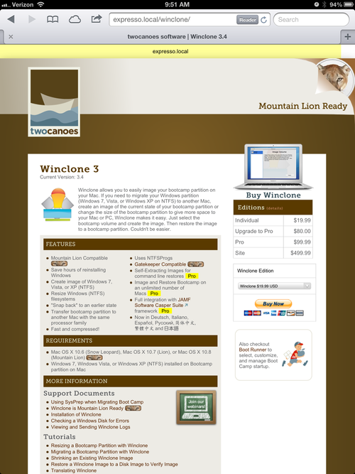
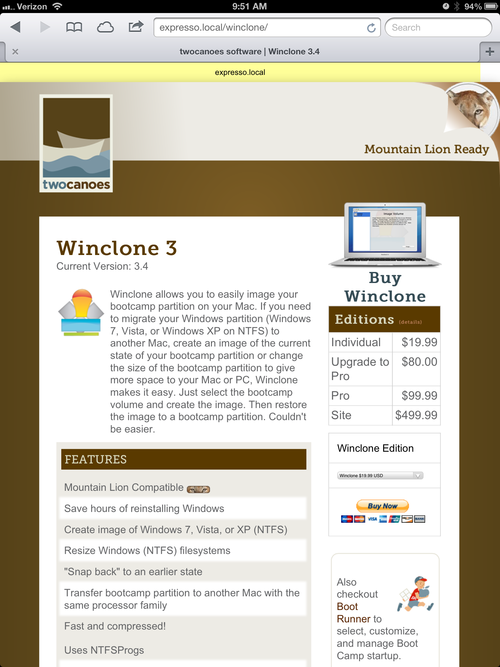
In general, just specifying body font-size for these three thresholds was enough to immediately transform much of the site.
Before
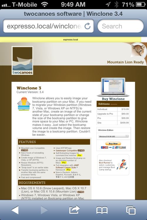
After
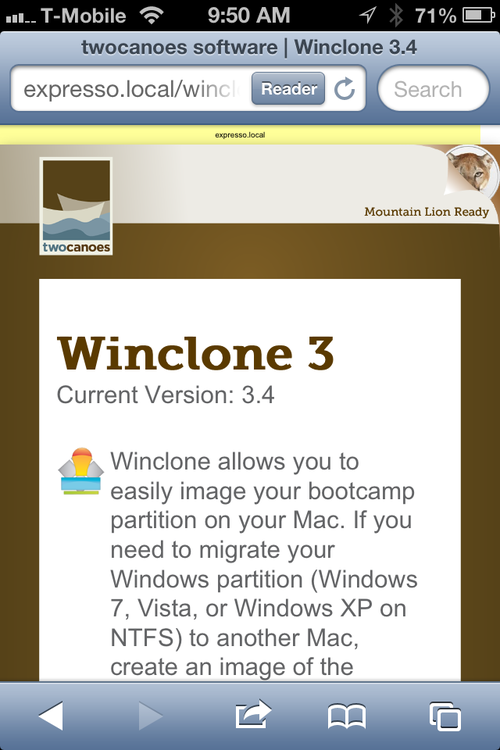
Before (Tablet)
After (Tablet)
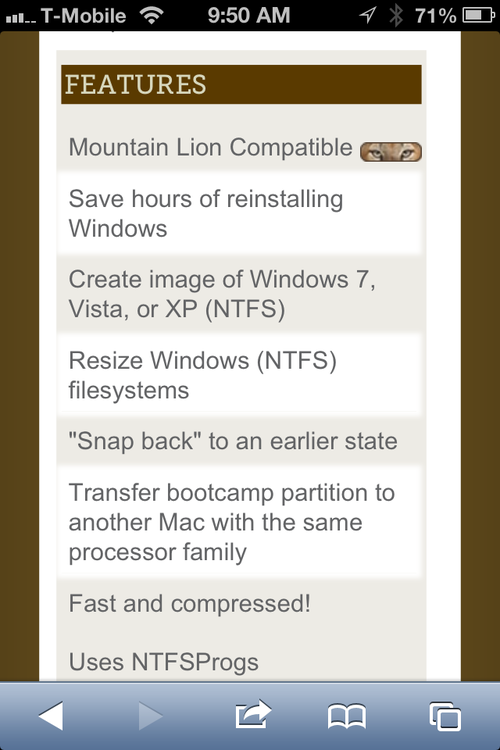
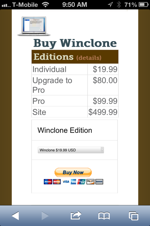
Dynamic Columns
To handle column presentation, I added rules to turn off the float property set for multi-column elements where needed by assigning “float: none”. This allowed columns that would otherwise flow next to each other to instead be rendered with each going underneath the other, reducing two columns to one. When necessary, I also added rules to handle centering of elements that were now not floated, so that everything in the one-column layout was centered the same.
Problematic Elements
Next, I went through and made a list of any elements with existing style rules that would need to be overwritten to handle an altered column layout, and added responsive rules for them.
And then finally I found a remaining problem: very wide blocks of content. For example, a very long string of text like a long url, or a block of pre-formatted code, would be too wide to display on a small portrait screen and would cause the rest of the page to shrink down to accommodate its width. A simple response to this, though, was to write a rule for the elements <p>, <pre>, and <code> that would handle overflow for palm view.
p, pre, code { overflow: scroll; }
Adding this rule would allow any page with such wide elements to be rendered normally, with the wide element being truncated at the normal edge of the container but allowing the user to swipe to scroll and view more. On larger displays where this would not be a problem, the rule would not even be involved. This is the beauty of responsive design.
Remaining Challenges
Twocanoes.com currently uses a number of elements that could be improved to work better with Responsive Web Design, specifically:
- Non-liquid page layout
- Resolution-dependent background images
- Non-vector-based illustration images
- Html-based presentation
- Pixel based element widths, margins, and paddings
- Significant structural html elements without defined id attributes
When the site is redesigned, if the new design avoids these types of elements, much less responsive styling will be needed. If the page is either completely or mostly liquid, nothing will overflow its container and relative sizes of elements should cascade more simply. If all background color is handled in css or with vector graphics, page liquidity in general will be much simpler. If all images that are not photographs are rendered as vector graphics, they will use less bandwidth when important for mobile devices and will remain razor sharp even on large retina devices. And finally, if html can be written strictly to describe content structure, and if css can be written with an overt intention toward flexibility (both not trivial tasks), almost no additional Responsive Web Design will be necessary because the founding vision of the web will already be maintained. Twocanoes.com will be able to be displayed anywhere and the experience will be the same everywhere.
More Information on and Examples of Responsive Web Design
Marcotte article on A List Apart
Boston Globe
(A non-technology site embracing responsive web design)
ColorZilla CSS Gradient Generator
(not responsive itself but a good tool for responsive site-coloring)